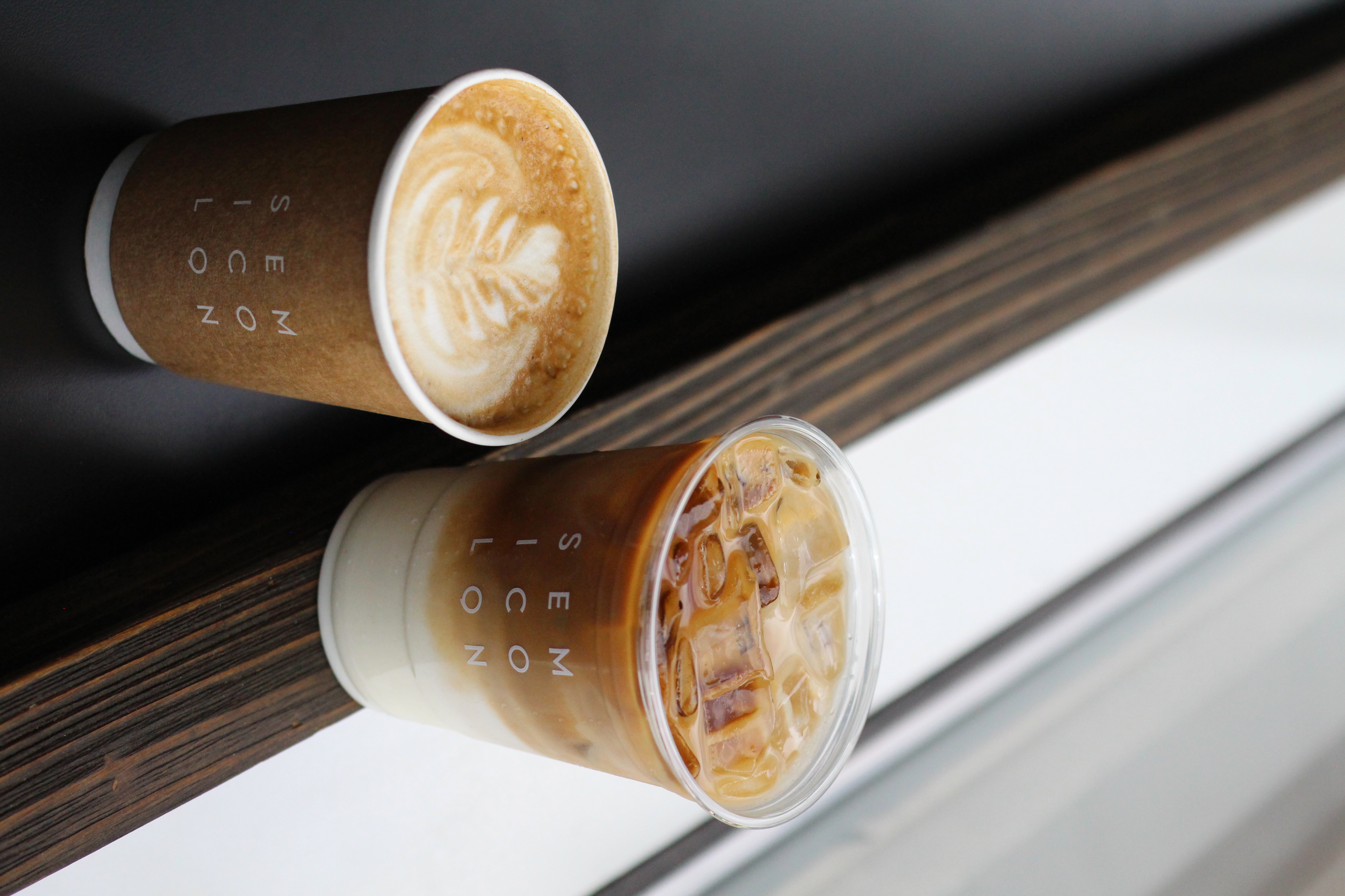
Semicolon Cafe
brand + visual identity / concept / design / social / art direction / packaging design
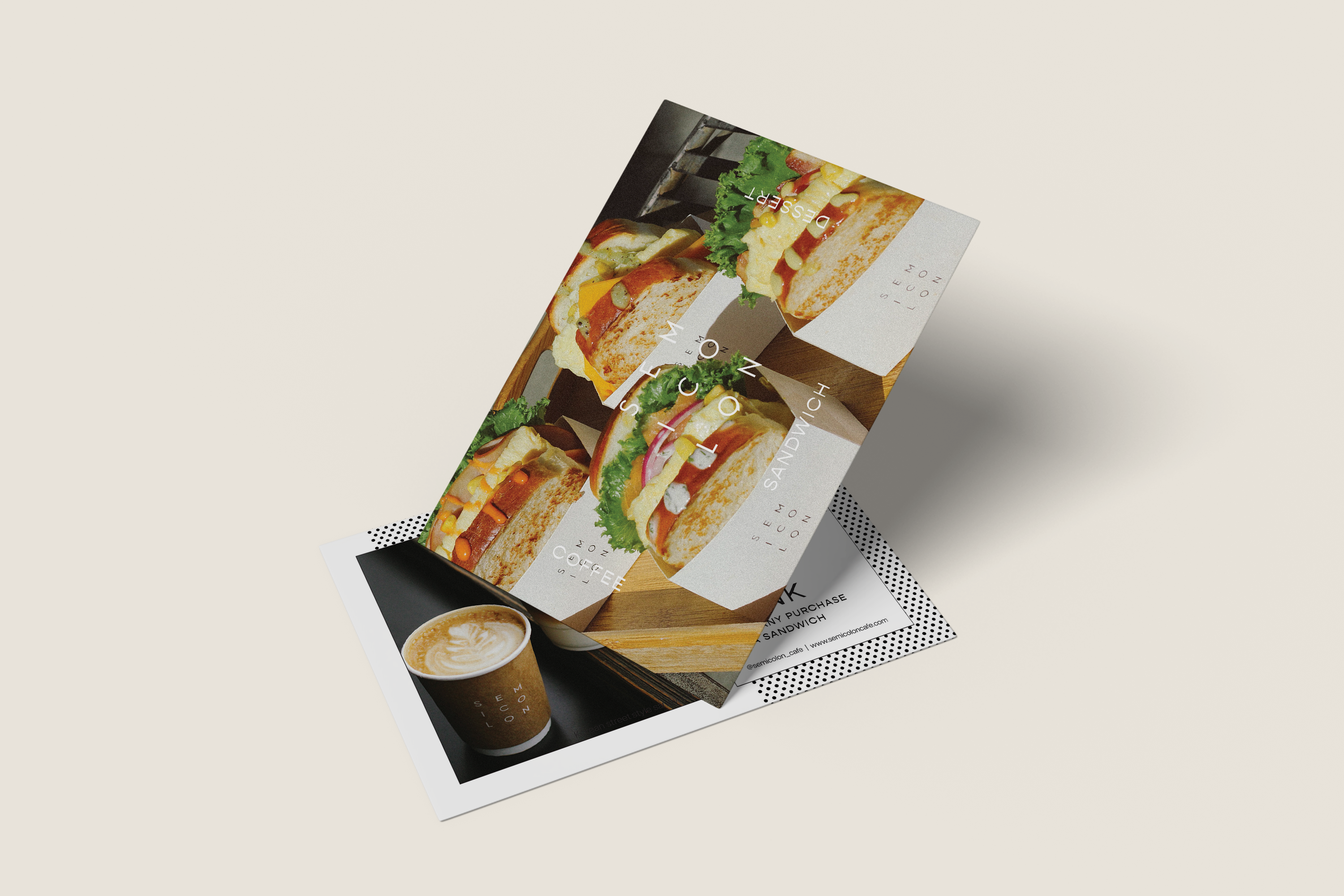
Semicolon Cafe is a coffee and sandwich shop that was inspired by Korea’s street food breakfast toasts. The first shop was opened in Jersey City and later opened in other locations including Upper Manhattan, Midtown New York, Washington, Virginia, and coming soon in New Brunswick.
︎Freelance design work

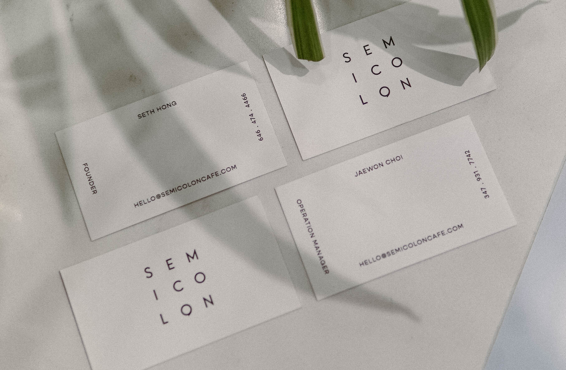
Semicolon is a symbol indicating a pause between two independent clauses.
Semicolon Cafe wishes to implement that same feeling of rest; a place to ‘pause’ for a break that was much needed from your everyday routine.
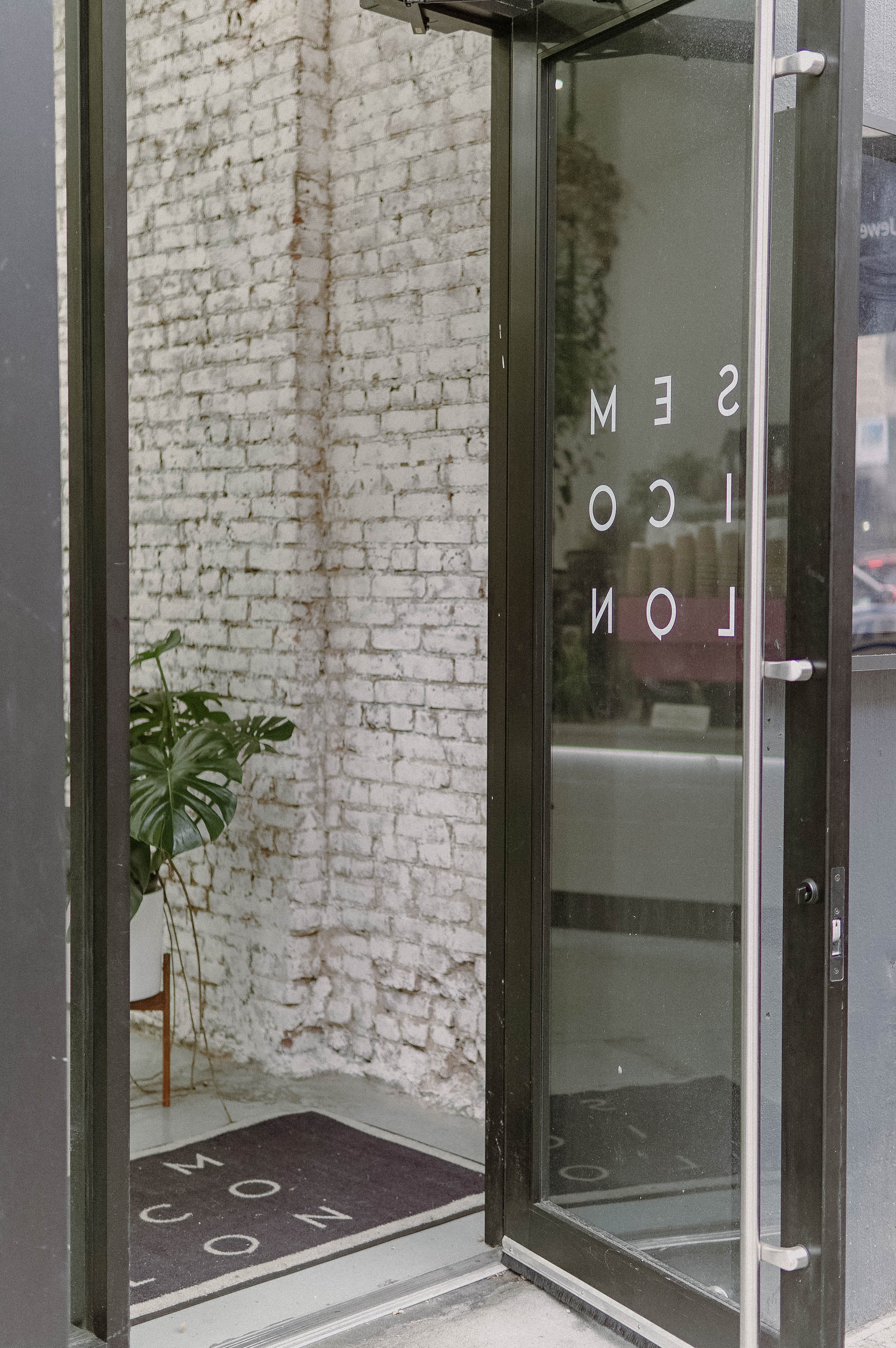
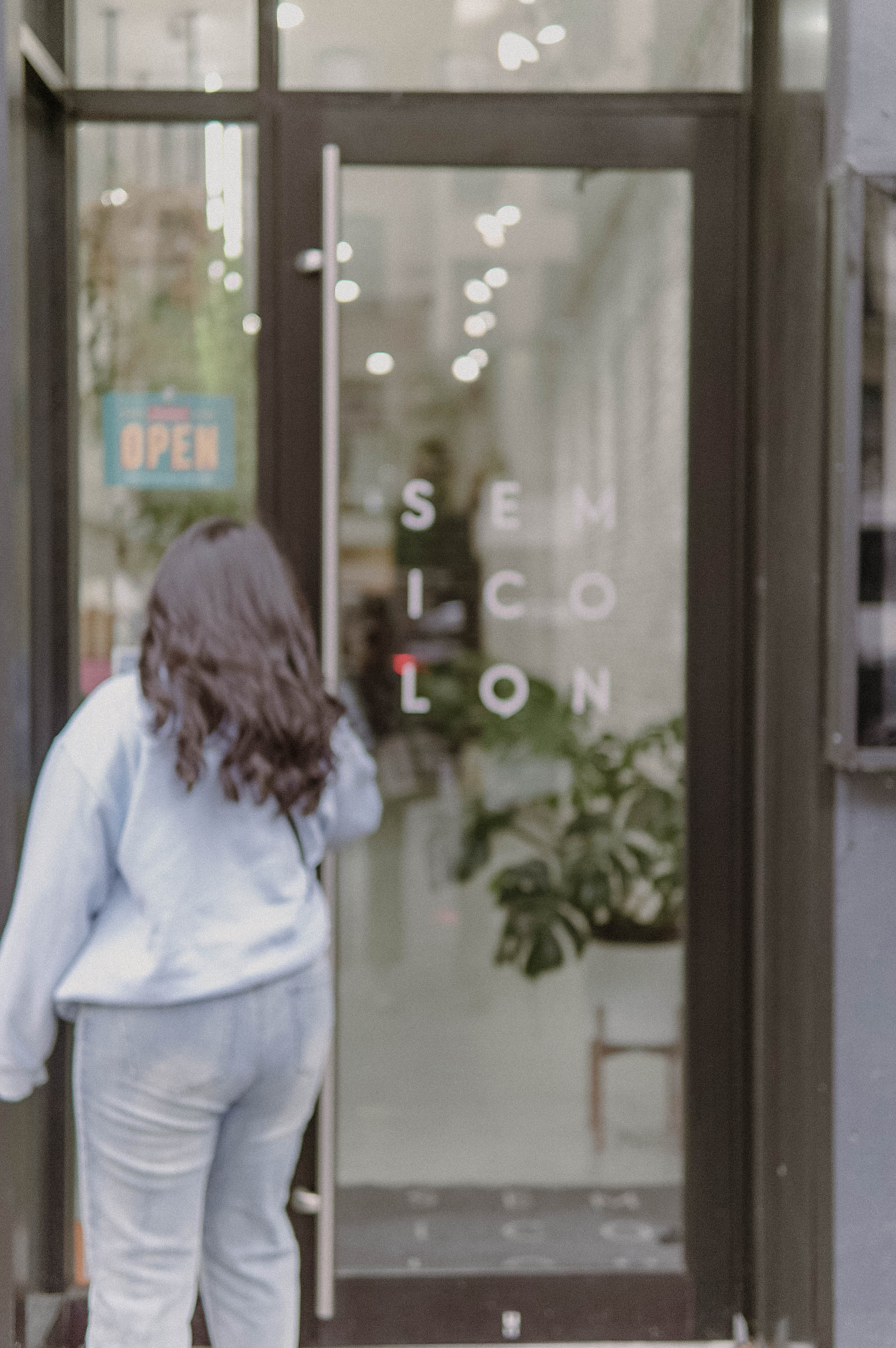
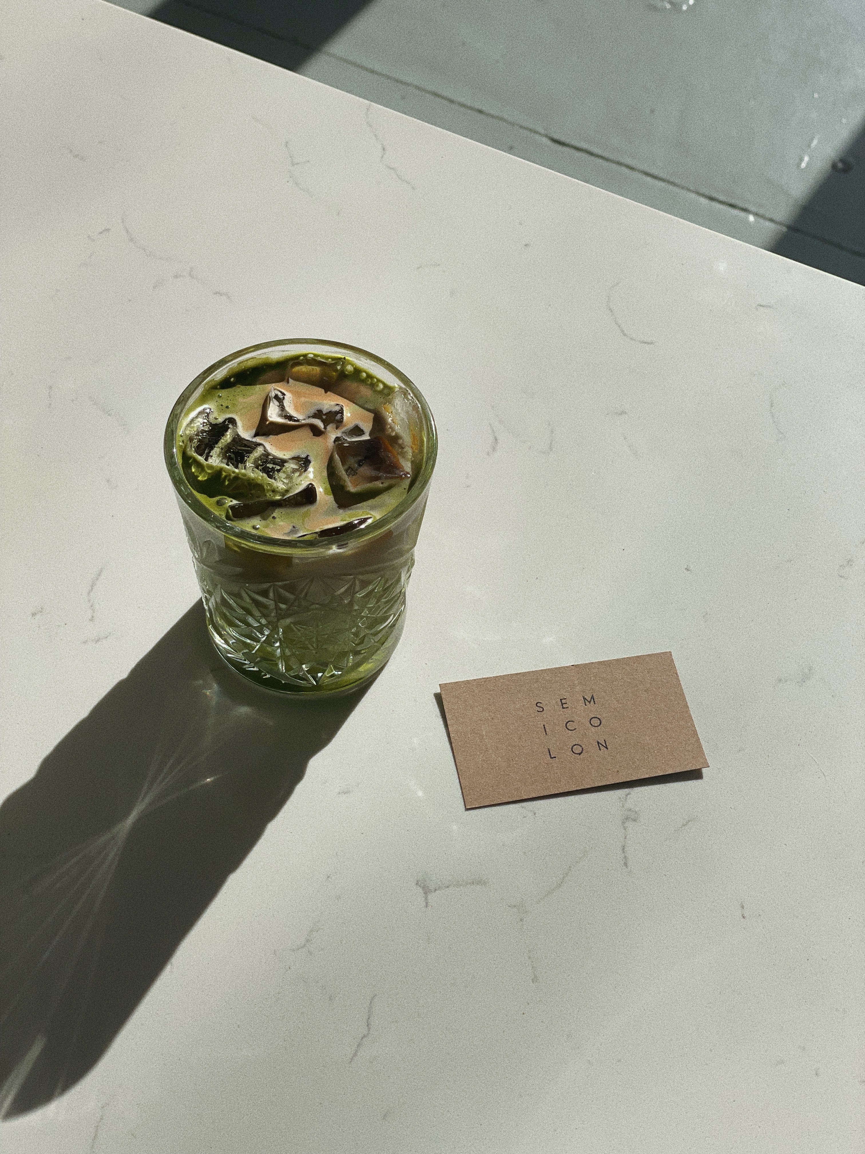
Inspired by Korean Street toasts, Semicolon Cafe’s flavorful-filled sandwiches come in a box that can be held easily to eat. With that in mind, Semicolon Cafe’s logo is simply put into a square shape without an actual border and made sure the actual semicolon is embedded to add a little touch.
Inspired by Korean Street toasts, Semicolon Cafe’s flavorful-filled sandwiches come in a box that can be held easily to eat. With that in mind, Semicolon Cafe’s logo is simply put into a square shape without an actual border and made sure the actual semicolon is embedded to add a little touch.