Nerine
branding + visual identity / concept / art direction / design
NERINE is an online florist based in the heart of NYC. NERINE will host floral events and parties. The main goal of NERINE will be weekly subscriptions for anyone interested and likely to change their floral arrangements at home according to their mood, seasons, etc.
Not only providing floral arrangements for events and places, but they also want to be differentiated from other floral companies, create diverse interactive events throughout New York City, and let people experience and learn more about NYC through florals.
Not only providing floral arrangements for events and places, but they also want to be differentiated from other floral companies, create diverse interactive events throughout New York City, and let people experience and learn more about NYC through florals.
︎Freelance design work

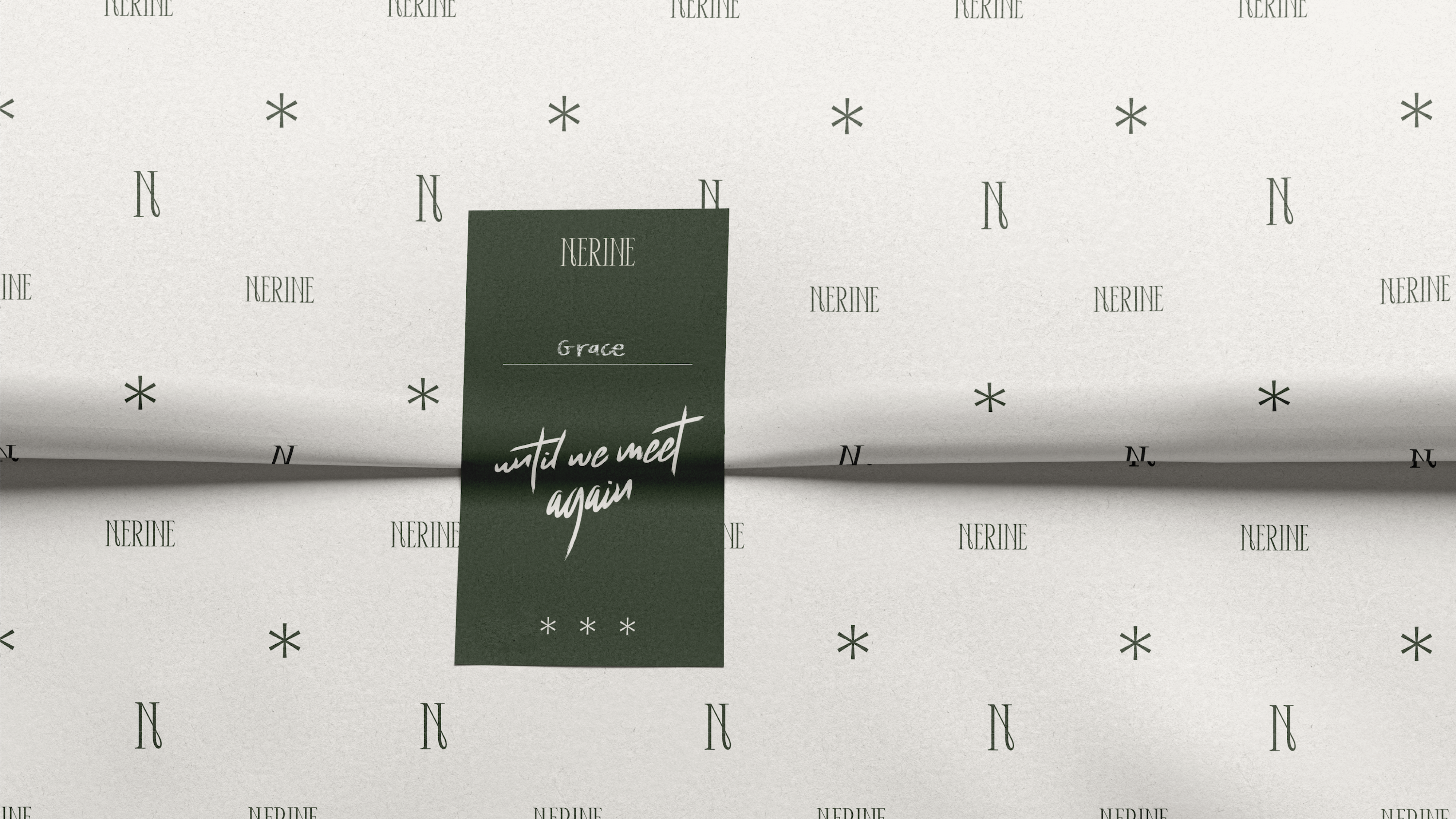
Until we meet again.
Nerine is a type of flower that symbolizes freedom & good fortune. The floral language for NERINE means “happy memories until we meet again.” With this in mind, we want to show how the branding can bring happy memories and let the customers feel they want to come back to NERINE for their services.
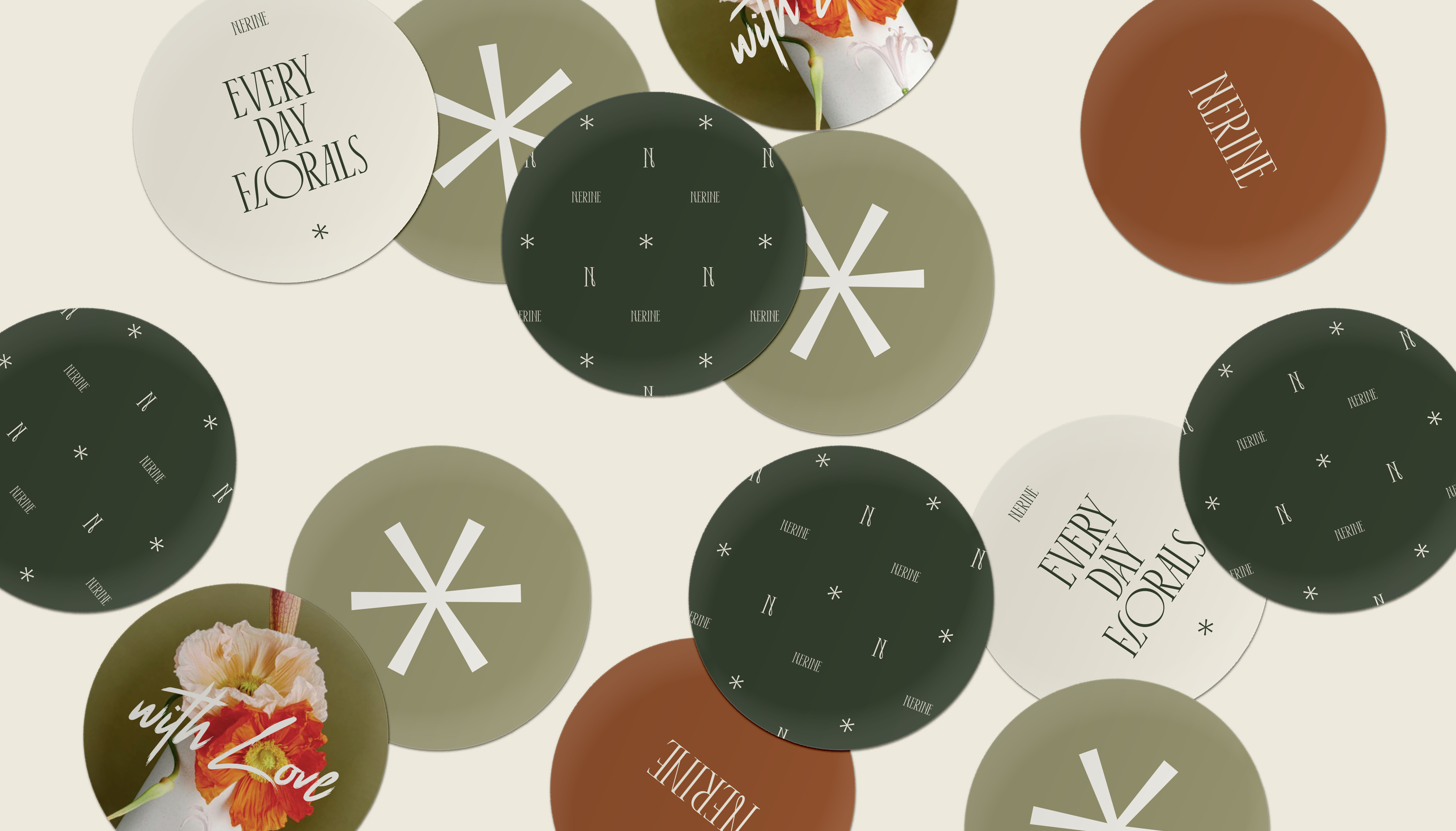
The brand icon element symbolizes the nerine flower that has been digitalized to showcase modern vision to life. Nerine grows to 2 feet with strap-shaped leaves and large umbels of lily-like flowers. Nerine flowers consist of 6 thin & long petals.
The brand icon element symbolizes the nerine flower that has been digitalized to showcase modern vision to life. Nerine grows to 2 feet with strap-shaped leaves and large umbels of lily-like flowers. Nerine flowers consist of 6 thin & long petals.